Skip to content
Article

Four steps to optimising B2B data analytics.

Share

Here are my tips for preparing your data for automation:

  • Use text filters to filter out records unwanted for analysis. For example, we exclude all email addresses containing ‘green-hat.com.au’.
  • Remove duplicate values of fields containing unique identifiers.
  • Join multiple data sources to create new custom datasets.
  • Convert ID fields (commonly misinterpreted as number fields) to text fields. If you leave the field type as number, you can add your IDs together (not useful), but you can’t group your records by ID (very useful).
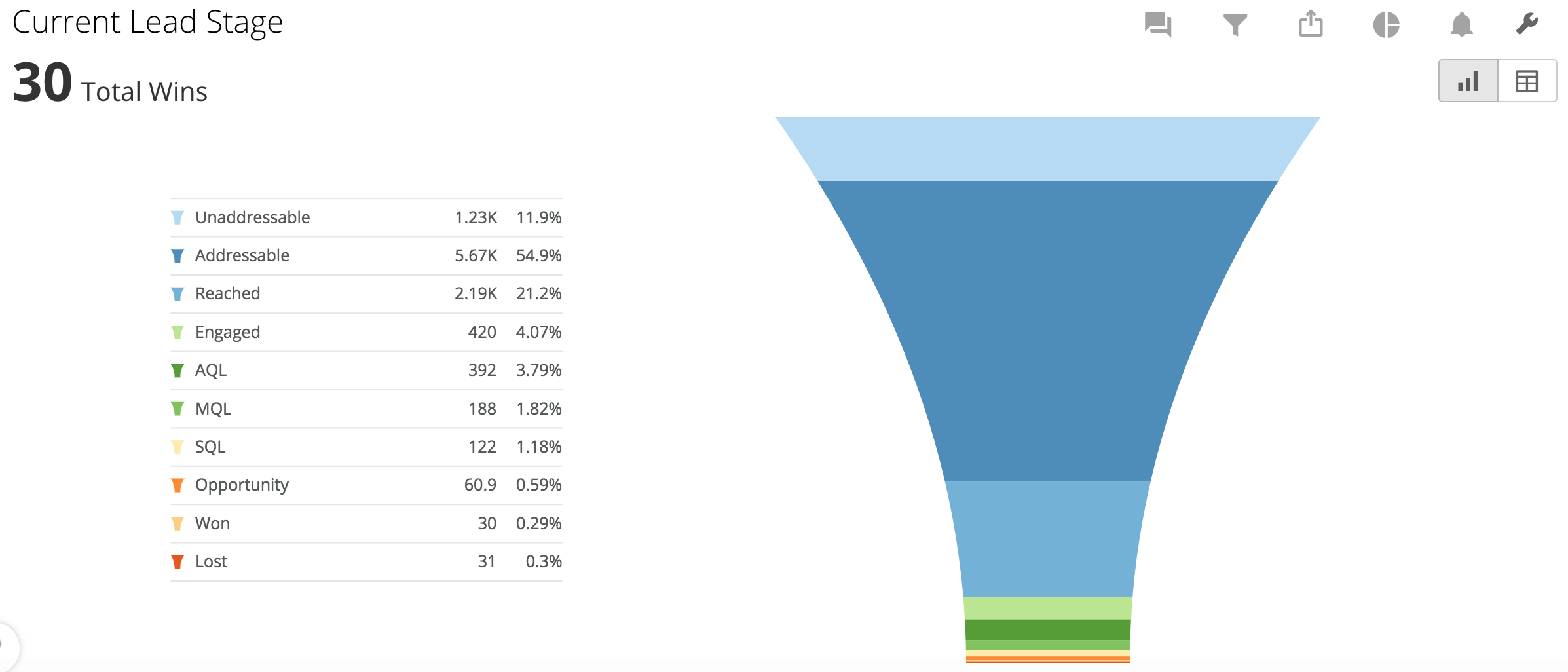
  • Create time-stamped batch updates for historical trend analysis. Changes that occur in your data can be recorded, with a time-stamp, each time the data is refreshed. For example, we could keep track of when someone’s lead stage changes. This would then allow us to show a trend of where our leads sit in our Sales and Marketing Funnel over time.

2. Automate your data

Business Intelligence (BI) platforms are used to analyse data from multiple sources, find insightful information and present it – in real time – in an easily digestible way. These online data powerhouses extract data from sources in the cloud through scheduled API calls (Application Programming Interface, in software terminology). No more visiting multiple sites to manually extract reports. Once the connection has been made, you can sit back and relax while the machines do the work.

3. Visualise your data

The visualisation of data allows for easier analysis that sparks an insights process. By visualising the entire picture into dynamic dashboards, you can begin to see important trends, learn what’s working well, spot the red flags and identify areas that need more attention. Deep diving into the analytics to try and answer arising questions can lead to vital discoveries, ultimately influencing our B2B marketing decisions.

Four common examples of data visualisation in B2B marketing:

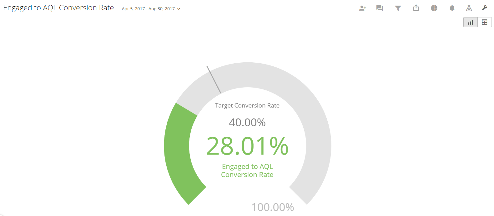
Sales and Marketing Funnels
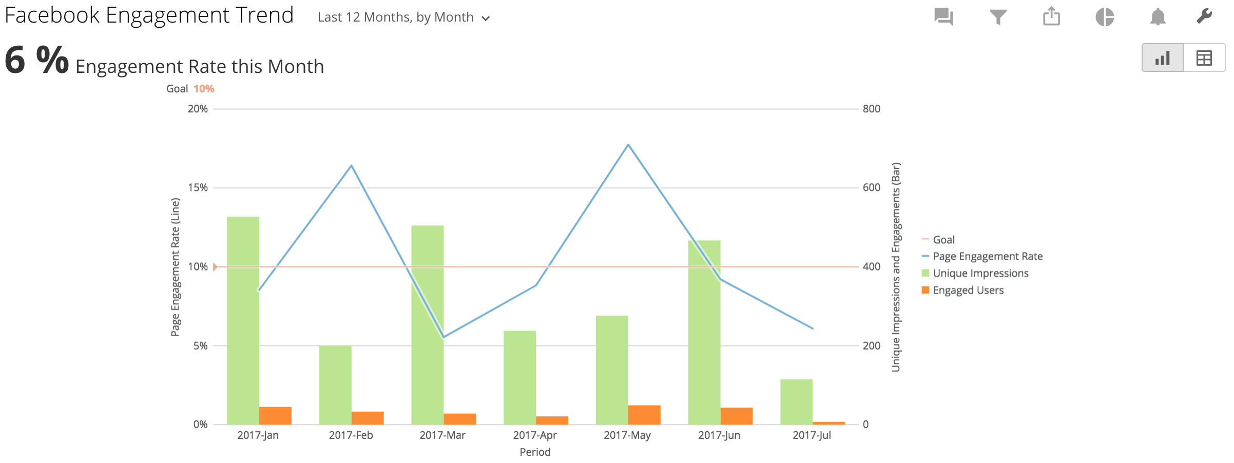
1

Funnels help us show the progression of leads through the stages of our nurturing campaign. They encapsulate the performance of a marketing campaign as a whole. The top of the funnel shows how effectively lead generation is performing, while the following stages demonstrate Marketing’s ability to advance leads through the funnel until they’re ready to be passed on to Sales and converted from leads into clients.

Conversion Rate Gauges

5-1

Goals around lead conversion rates are set at the beginning of a campaign. The Marketing Qualified Lead (MQL) to Opportunity conversion rate is particularly important for marketers. Conversion rate gauges are a great way to focus on targets and make sure you’re working towards a high speed of lead progression through your pipeline.

Website Traffic Analytics (Google Analytics)

3

Many campaigns focus on bringing leads to an organisation’s website. Visualising website traffic trends helps to find what’s working and what needs improvement. Traffic Source data visualisation shows you where your website visitors came from. Drill downs can then compare how customers coming from these different sources behave across the website.

Social Media Engagement Trends

4

Social media engagement rates are a good measure of how a platform is performing relative to its audience size. Here you can see which posts are resonating well with the online social community and keep track of your online presence across multiple platforms.

4. Keep track of your data

Keeping on top of a large analytics dashboard can be time-consuming. Automated alerts are a great way to make sure you’re keeping your finger on the pulse. Alerts can be set up to send a text to a mobile phone number or email whenever a specified threshold is met, for example:

  • 10 new leads were converted from the MQL to Opportunity Stage
  • Website sessions increased to 25% above the monthly average
  • LinkedIn engagement rate increased/decreased by 5%

In summary…

Data analytics can be an intimidating task for many organisations, so remember the following:

  • Cleaning and preparing your data eliminates anomalies and customises it to your needs
  • Automating the extraction of data will ultimately save time and effort
  • Visualising data via an analytics dashboard gives insights, reveals trends and raises flags to guide a continuous improvement process
  • Setting up alerts allows you to stay on top of any important fluctuations such as the need for rapid action or key milestones reached
Share

Tushar Warrier

Over the past 15 years, Tushar has worked with B2B and B2C brands across the Asia Pacific region, particularly in Singapore, India and Australia. He prioritises problem-solving and has worn many hats across his career – the latest being a Green one. At Green Hat, he works with our clients as Head of Marketing and Growth, as well as a part of the Account Service team.