
 Digital
We are constantly being reminded that we are living in a data-driven world and the rate of data production is growing at an astonishing rate. According to an IDC study, we produced 4.4 zettabytes of data in 2013 and we are predicted to hit 44 zettabytes by 2020 (that’s 5,200 gigabytes per person). So with this rapid increase of data production, companies have to evaluate data faster and in more depth than ever before.
A key component of understanding your own data is through visualisation methods. Data visualisation allows you to receive and absorb large amounts of information in ways that an excel pivot table cannot begin to fathom. By being able to interact and understand the wave of incoming data you are able to see patterns emerge and act on them before they begin to take place.
The need for businesses to adopt visual displays of information-finding is becoming more obvious. A 2013 study found that those who were using data visualisation methods (compared to managing reports through tables/charts) were 28% more likely to find information in a timely fashion (i.e not getting stuck in Excel hell). In addition to this, 50% of organisations who represented their data visually found that they could easily assess and manipulate new data sources being filtered into the business.
With the importance of data visualisation in mind, let’s look at the three key steps in order to create a meaningful representation.
1. Tell a story
Nate Silver (founder of FiveThirtyEight and a hero for us data nerds) wrote a book about distinguishing between ‘the Signal and the Noise’, that is, what meaningful story we are looking for amongst the clutter of disparate data sources. At Green Hat, we’ve found this to be a key component of our data analytics i.e. being able to represent a clear idea in one visualisation.
The first step to being able to tell a powerful story stems from who the audience is looking at the visualisation. There is little use in creating a presentation for the CMO which would be better suited to the CFO.
The second step is understanding what you are trying to say in your story and selecting the correct data to help explain this. This involves understanding what is being plotted on which axis (are we measuring against time, dollars spent, funnel stage). This is where a company can get bogged down in the detail and a ‘more is less’ approach is better suited. (Do we really need an entire visualisation showing how many unsubscribes we had from an internal email in the 2nd week of March?)
An effective story through data visualisation should be easily conveyable and simple to understand.
2. Provide action
So we’ve conveyed our story through the visual presentation of the data, so what? The crux of visualisation should be that it provides an actionable idea to take away (we aren’t making these because the colours are pretty).
One of the greatest things about pooling your data and analysing it through visual graphs is the ability to spot trends, observe relationships and discover patterns in their infancy.
I think a great, current example of how the visualisation of data is providing real action by conveying statistics and data clearly, is through Google’s Project Sunroof. Google has taken its vast database of aerial maps and through intense data manipulation (like factoring out nearby structures, possible sun positions for a 365-day period and historical weather patterns) are able to give you an idea of the amount of sunlight your roof will receive and the savings to be made through solar power.
Now that’s real action from data.
3. Be honest
It is vitally important that when showing data we are honest in the way we represent our information. As discussed above, the whole point of data visualisation is to tell a story, but it is very easy to fall into the trap of manipulating the axis or data plots to support a bias.
One of the most common mistakes is changing the range to create a greater effect on the numbers. It is important to maintain consistency across your charts to ensure that you aren’t leading people down a rabbit hole of mistruths. At the end of the day, it is better to be honest and upfront.
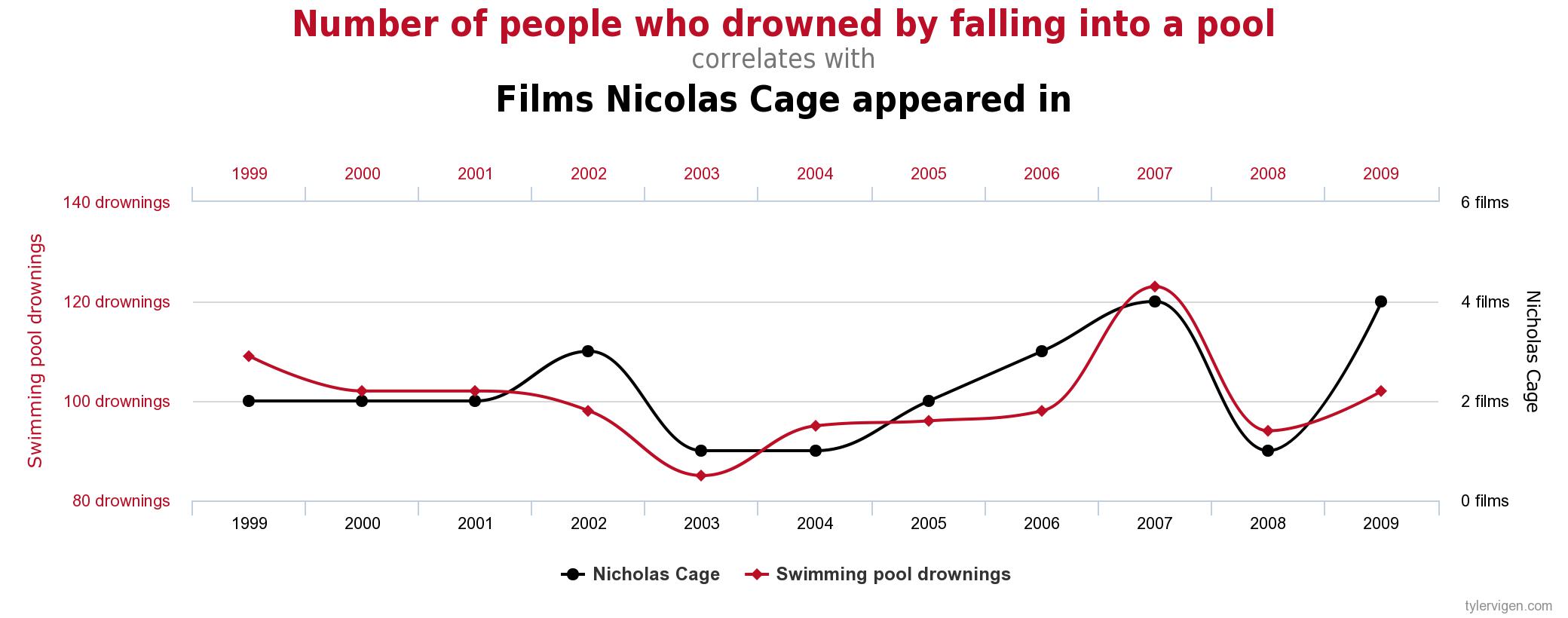
The other big no-no is plotting two vastly different data sources on different scales to create spurious correlations. One of my favourite blogs is dedicated to these sorts of correlations. Check out a great relationship below.
Within the B2B world, we are starting to see how vital data visualisation and analytics tools are for a business. The ability to collect, collate and distribute the right data, to the right person, at the right time is helping businesses make better decisions and differentiate themselves from competitors.
I hope this has provided you with a bit of insight into our world of data analytics and visualisation. Here at Green Hat we’ve been getting our hands dirty using our visualisation tool Domo and have been creating meaningful insights for a number of clients.
If you need help visualising your data, let us know.