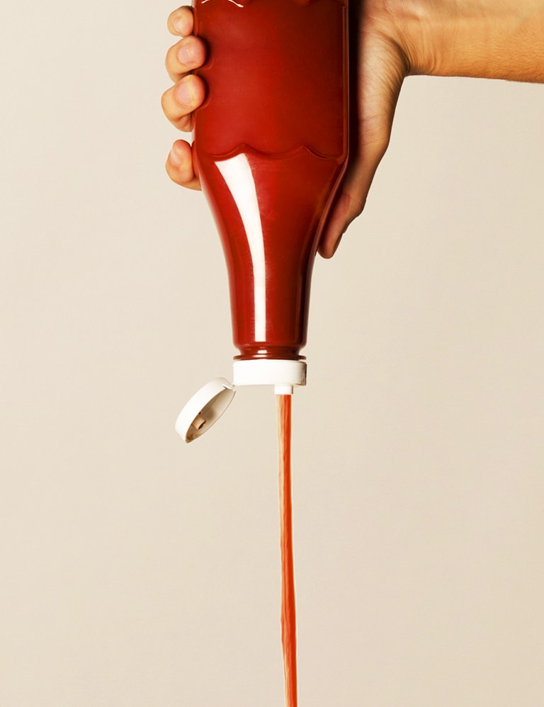
We all know that subtle feeling of happiness when your favourite product evolves its design into a superior design experience that you didn’t even realise you needed. Remember Heinz flipping their tomato sauce bottle upside down? Revolutionary! This change demonstrates the importance of user research as well as observation.
The ideal UX design framework will differ from company to company. This means it is completely okay to stray, switch or branch off from the stages outlined below. What is important are the key tools and principles you apply to your problem space to find the best solution for your user.
Following this UX design framework will not guarantee a fast track to the most wonderful, magical and intuitive product – though it will provide the mental model and process for UX designers to navigate the ambiguity that is often faced when deciding what makes good UX design.
So let’s get started.

Stage 1. Define
Before getting started with any project, you need to understand the basics first. During the define stage, your goal is to clearly identify and understand the problem or opportunity. This ultimately means being in touch with your user and brand.
User: To understand your user – determine what problems they are facing. When you can identify the problems then you can begin to start working towards the solutions. But first things first – don’t jump the gun. It’s natural to have already thought of a solution before starting, but remember to be patient and fully understand the problem space first before immediately jumping to solutions.
Patience is an important UX principle to learn to become a more effective UX designer.
Creating customer persona profiles is a great method to summarise your users in the initial stage. Personas are rich representations of your users and are built from both qualitative and quantitative research. Keeping your personas current and relevant with new information will ensure they continue to be a valuable tool throughout the UX process.
Brand: Be sure to identify the problems facing the users and the core goals of the brand to see how they align. Using existing research is initially a great way to increase your understanding of the problem space. Here are a few ways you can uncover this existing knowledge:
- Desk research: i.e. website analytics, research reports, academic papers, blogs and articles.
- Benchmarking activities i.e. landscape review, expert review, data and analytics, heuristics review and system usability scale
Make sure you are asking a lot of questions to fully understand your problem space:
Goal – What are your company’s values and mission? How does this project contribute to that goal? Is this the right time for your company to be pursuing this project?
Context – What is the background and current situation? What other information relates to the context?
Objectives – What is the desired outcome of the project?
Key results – How will you measure and define success?
Constraints – What are the known constraints (i.e., time, money, technology . . .)?
A UX Designer needs to be curious – this mindset is related to inquisitive thinking, exploration, investigation, and learning.
Stage 2. Explore
After you know that this project is in line with your core mission and you know what questions you’re trying to solve, you need to conduct research. Your user research is going to be a fundamental part of your project. The information you discover during this stage will lay the foundation for your entire project.
Good user research challenges all your assumptions – never confuse your needs with the user’s needs. People tend to overestimate the extent to which their opinions, beliefs, preferences or values are the status quo – leading to a bias design.
The most critical thing you can do as a designer is not challenging your assumptions.
In the explore phase you’ll be conducting both quantitative or qualitative research methods. Quantitative is a measure of quantity, it’s objective by nature and this method tends to satisfy your data-driven stakeholders. Quantitative research could include surveys, analytics, A/B testing, card sorting and tree testing. Qualitative is a measure of quality – measured by people’s thoughts, feelings, perceptions, ideas. It gives you descriptions, context and most importantly the ‘how’ and ‘why’. Collecting this research could include interviews, diary studies, observation, intercepts and usability testing.
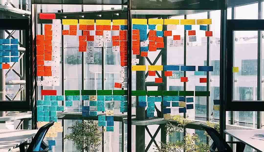
Once you have conducted all your UX research, it is quite common to feel overwhelmed with all this information so a good way to help understand is to synthesis. Synthesis is a sense-making process where you uncover meaningful insights from the data collected from your research. A helpful process is to create an affinity map, where you group and create relationships and patterns in the data that you have collected. This can be conducted physically with post-it notes or digitally through programs such as Trello, Mural or Miro.
Stage 3. Concept
Once the synthesis stage has organised any findings or insights, you can begin turning your findings into design concepts. Now begins ideation. Ideation is a divergent activity which emphasises on the volume and creativity of the ideas generated. Having a diverse range of people involved in your ideation workshop can be a great way to achieve a creative assortment of ideas.
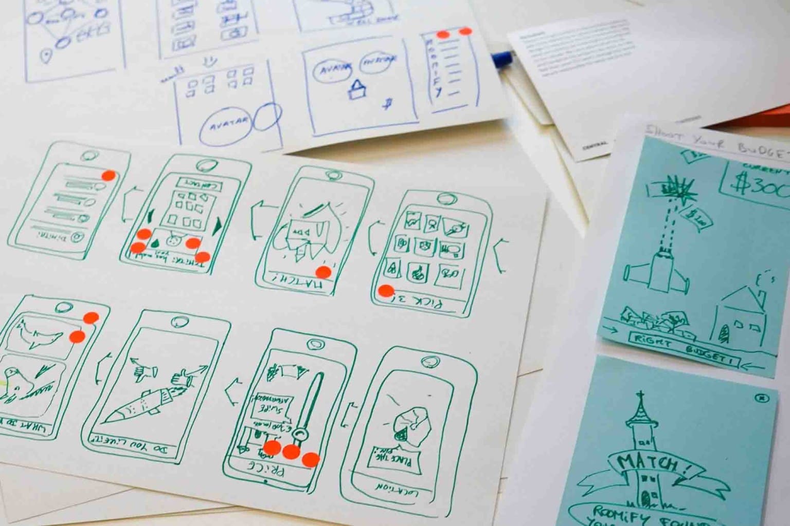
Use sketching and storyboarding to quickly transmit an idea, iteration or concept in order to quickly visualise and save time and resources. Crazy 8s is an example of a great sketching exercise to get the ideas flowing. In this exercise, you will come up with eight ideas in eight minutes. After each round of sketching make sure you review and evaluate your work to see if they are relevant to the problem statement, constraints, project goal and objective. Feedback from others is also very important to grow and expand your ideas.
With a data-driven approach make sure you prioritise all your ideas to mindfully select the solutions that best align with your purpose. There are many frameworks that can help with this process, here are a few techniques; UCD framework – desirability, feasibility, viability, dot voting, effort vs impact, and informing prioritisation.
Once you turn your research into tangible ideas you can iterate, combine and refine these into your first low-fidelity prototype to test with users.
Stage 4. Design
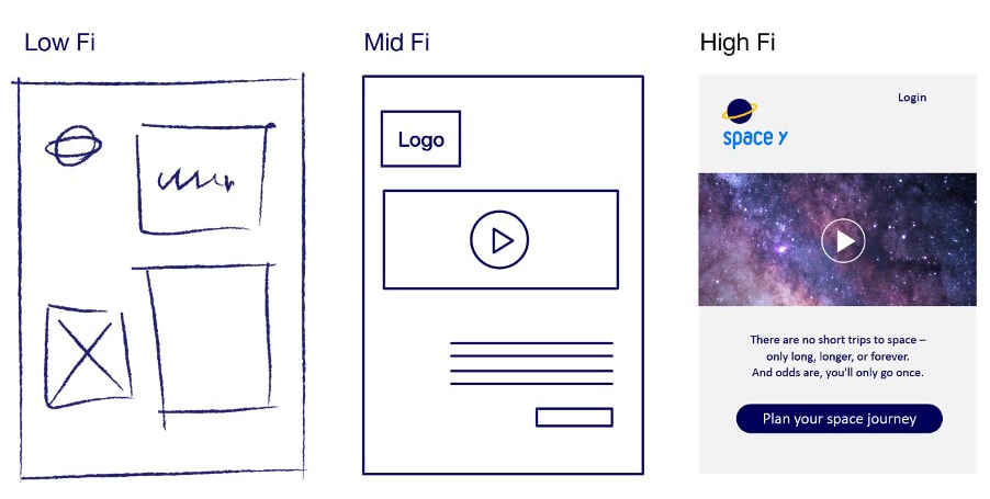
Now it’s time to actually build out your design, prototyping allows you to quickly transform an abstract idea into something more concrete that your user and client can see and play around with. A project usually goes through multiple rounds of iteration and validation before progressing up the chain of fidelity from low to medium to high.
By starting with low-fidelity paper prototyping you can easily gather early feedback on the suitability of your idea without a great deal of effort or investment.
This would be followed by digital low-fidelity wireframes. A wireframe is effectively a blueprint of a product or service. It usually focuses on allocating space, prioritising content, the functionalities available, and intended behaviours.
With mid-fidelity prototypes you will start to include interactive functionality and global elements such as navigation, colours, typography (fonts, weights), placeholder images, other graphic elements and some units of content.
Once you are at the hi-fidelity stage this should nearly resemble the final designs and appear to be fully functional from a user’s perspective.
Stage 5. Test
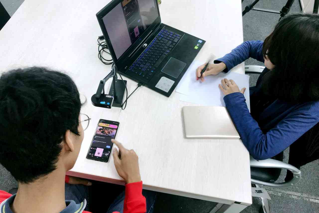
Testing is a fundamental part of the overall UX design process. We test because it allows us to improve upon the original product or site design and to see if the changes we make during the design phase hold up. At each design phase – low, mid and high fidelity you will be wanting to conduct some usability tests to uncover the problem areas and reduce the risk of releasing a product that is unusable.
Typically, during a test, real users will try to complete tasks while observers watch, listen and take notes. The goal is to identify any usability problems, collect qualitative and quantitative data and determine the user’s satisfaction with the product.
Stage 6. Iterate, Iterate, Iterate
The design stage is an iterative process. That means you won’t get it all done in the first go. You’ll have to design, redesign, test, scrap it, and design it all again. In UX design you’ll explore abstract phenomena, where the answers are unclear or unknown.
Revisiting synthesis after each usability testing session will allow you make sense and remember all of the themes and patterns in your findings. As you translate your findings and insights into solutions, you’re forced to make assumptions. Your assumptions should be tested, and then the design is iterated – based on what you learn. UX design is rarely finished and you should always strive to evolve your solutions via iteration.
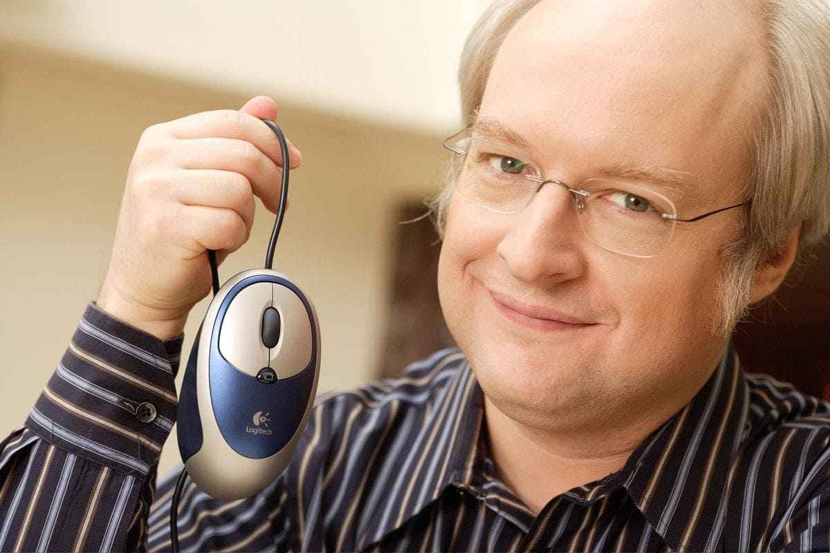
In the words of Jakob Nielsen: “A bad website is like a grumpy salesperson.” And none of us wants that… So to find a process that works for you, your team, and most importantly – your users. This will guide you to achieve that wonderful, magical and intuitive product fit for your user.
 Strategy
 Creative & Content