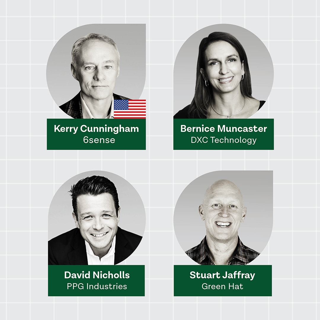
Whether you’re designing for screen, print or interactive experience, these well-established design principles will help your content cut through the clutter and bring consistency to your messaging and B2B marketing.
Colour attracts attention, groups elements, establishes meaning and enhances interest. Colour should be use conservatively to make it easier for the eye to process, a rule of thumb is no more than five colours in one composition.
Remember that cool colours recede and warm colours reach out. Using tones of the same colour or combining colours with grey tones can help with the grouping of elements.
Read more: Star Wars & the power of colour
Alignment is the placement of elements along a common edge, centre, row or column.
Alignment creates order and stability for designs and it is a powerful tool for leading the eye where you want it to go. Hence, alignment can enforce messaging and strengthen calls to action.
Hierarchy is a simple tool for grouping, organising and understanding information.
Size, colour and proximity are elements of hierarchy that can be used to show relationships and emphasise important information. Check our style guide for more.
Consistency in graphic communication enhances recognition and emotional engagement and it underpins branding.
Strong brands use the consistency of colour, font and graphics to build customer relationships and brand recognition across varied outputs. Coca-Cola is a perfect example of a company that has used consistency to build its brand over the years.
Strengthen your content and B2B marketing using these core graphic communication principles. Click To TweetNegative space between visual elements helps to balance a design and focus a viewer’s attention on something specific, like the call to action.
Whitespace is a powerful tool for creating strong messaging when used with colour, alignment and hierarchy.
Related: The formula for a great Call-to-Action
Screen and print interfaces should be designed to be usable by as many people as possible. Accessibility means that that designs should accommodate people with diverse abilities without having to be adapted or modified.
Accessible designs should be simple, easy to perceive and operate. Simple designs are easy for everyone to understand regardless of age or ability.
Some basic guidelines for improving simplicity include removing unnecessary elements and presenting only relevant information and feedback. Make sure to check your font and button colours and sizes, ensuring the contrast and size are easy to read and use.
Following these universal design principles will strengthen your content and help to build a strong asset library, which in turn supports your overall B2B marketing strategy.
Other popular posts